4 Web Dashboard Mistakes to Avoid for Effective Data Visualization
August 4, 2021

Today, many organizations rely heavily on data analytics and visualization tools like web dashboards to drive critical decisions across all departments.
However, your web dashboard is only as good as its ability to clearly and concisely communicate the information its users need.
Is your custom dashboard helping leaders glean insights and make agile, data-driven decisions? Or is it giving users stress and confusion? Watch out for these four common mistakes in designing web dashboards.
4 Common Web Dashboard Pitfalls
Business professionals use web dashboards to analyze information easier and faster. So, if your application doesn’t result in actionable insights, you can make it better. Plan with your team, set goals and agree to stay clear of these four common web dashboard mistakes.
Mistake #1: Cramming All Metrics Into a Single Dashboard
Not every KPI deserves a spot on your web dashboard.
While it’s tempting to present as much information as you can, you need to be intentional with the data you show. Identify the specific goals of your dashboard and choose only the metrics that impact those goals.
Do you want to keep track of trends to create new marketing strategies? Determine the factors affecting your sales? Boost employee morale with incentives?
Set your goal, choose your metrics and keep your dashboard focused and streamlined.
Mistake #2: Using Inappropriate Visual Tools
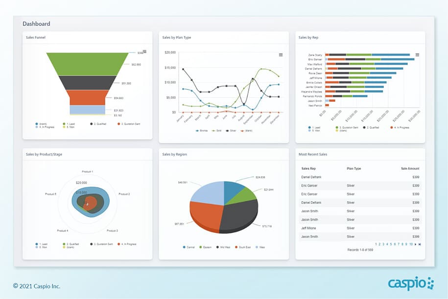
For data visualization to be effective, use dashboard tools that help you present data in the best ways possible. Here are a few data visualization tools and how you can use them correctly in your dashboard:
- Tables – Use tables instead of charts if you want to show precise values in detail. You can even use pivot tables to summarize large amounts of data.
- Charts – Use charts to interpret relationships between multiple variables and to highlight trends and patterns.
- Funnels – Funnels work best for tracking figures through stages, such as forecasting revenue from incoming deals.
- Pie Charts – Pie charts help display proportions, such as determining which marketing channel brought in the most leads for the month.
Mistake #3: Showing Too Many Visual Elements
Don’t overdo visual storytelling.
A dashboard that’s too flashy or cluttered doesn’t help accelerate decision-making. It raises unnecessary questions and, in turn, affects everyone’s productivity.
Keep your online dashboard tight by carefully choosing your legends, color schemes, labels and other visual elements. Make sure every element in your dashboard serves a clearly defined purpose.
Mistake #4: Using Charts and Nothing Else
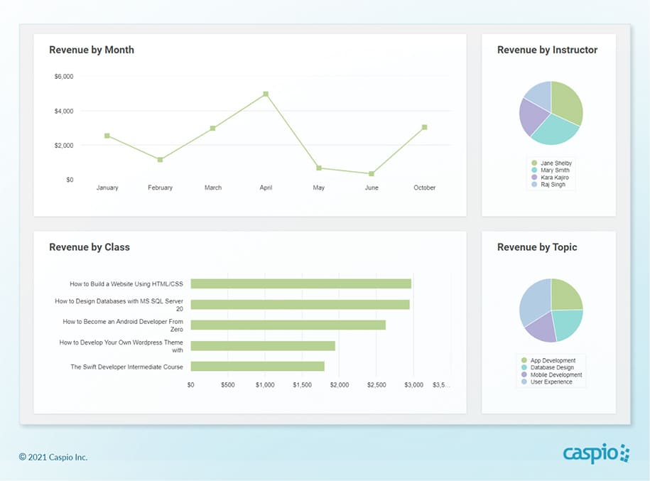
Charts are great tools to show data visually but don’t forget to narrate with plain numbers, too. In some cases, you’ll even need to deliver reports in table format.
A rigid, chart-filled web dashboard will either bore or overwhelm users. Instead, build engagement and complete your narrative by strategically placing relevant figures like totals, percentages and averages into your web dashboard.
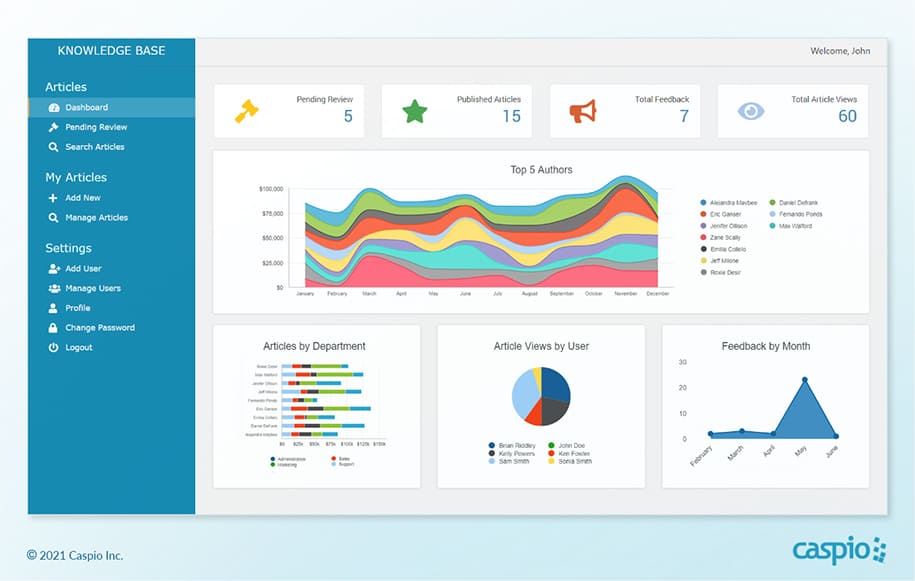
To sum it up, data visualization helps organizations steer their business in the right direction, and web dashboards serve as the best tool for the job.
But before you start building a web dashboard application, be sure to determine your goal and which metrics to track first. Choose the appropriate data visualization tools and keep the dashboard clean so users get the insights they need to drive your business forward.
Build a Web Dashboard Right, Right Now
Are you ready to build a web dashboard application for your organization? Web dashboards are not as complicated to build as some people think.
“I have zero coding experience or any IT experience for that matter. Caspio helped me fine-tune our application to function in ways that I never imagined it could,” shared Paola Deininger, applications specialist at S&S Worldwide.
S&S Worldwide, a global manufacturer of roller coasters and other amusement park rides, was forced to deal with unwanted delays due to sprawled spreadsheets. Using Caspio’s no-code platform, S&S Worldwide consolidated their data in centralized views and dashboards. This enabled them to make timely decisions on production and maintenance procedures.
“Caspio has taken our business up a level and streamlined our systems. We now design and engineer rides much faster, which results in more rides sold each year,” Deininger said.
Manage, view and derive essential insights from massive amounts of data by building your own business dashboard today.
Caspio’s no-code development platform makes it easy, even for those with little to no programming background. Centralize all your data in the cloud with an online database, deploy your applications to any website, and achieve dynamic reporting and real-time insights — all by clicking, not coding.
Sign up for a free trial today and experience the ease of creating online database applications with Caspio.
