Native Apps vs. The Mobile Web
February 25, 2011

If you use a smart phone or handheld device to browse the web, you know the frustration of arriving at a website that is not optimized for these devices. Google’s CEO Eric Schmidt recently stated that mobile web traffic was increasing faster than “all our predictions.” An increasing number of web users consume content exclusively using mobile and handheld devices, particularly in developing areas of the world. If you haven’t considered mobile browsers, you may be ignoring an important user base.

Caspio has been at the forefront of mobile web technology by using cross-browser technologies, such as our chart engine, which does not use Flash. And by providing useful frameworks and best practices such as the iPhone/Android web development kit which moves mobile web apps from drawing-board to device with lightening speed by leveraging Caspio’s point-and-click creation wizards.
An interesting article from Smashing Magazine makes the case that cross-browser mobile web apps are really a more economically responsible alternative to native apps such as iPhone and iPad apps available through the iTunes App store.
The logic here is simple. New mobile devices are being developed by all major hardware manufacturers all the time. Each new device may have different coding practices, different hardware capabilities, and a different submission process to a proprietary app gallery. At the 2011 Consumer Electronics Show (CES) Samsung alone announced two new tablets and two new smart phones.
Imagine the development process it takes to create even one native app. Now imagine porting it to run on each new hardware system, updating the code base to stay ahead of new features and revisions. In the end you’re either learning how to code for every new handheld device, or hiring a specialist and hoping they’ll still be around when something breaks.
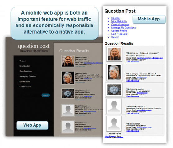
Browser based apps conveniently circumvent these issues and are already being embraced as a viable alternative. Browser markup is standards-based so often the only step required is reformatting for smaller screen resolutions. CSS already includes screen and handheld media types to automatically select the best style sheet available based on the end users device.
Instead of the individual design, development, and testing involved with a customized app for each device, Caspio’s embeddable DataPage interfaces function in the same way whether loaded on a desktop, mobile, or handheld browser giving consistent access to the same online database.
Resources:
- If you’re interested in seeing how to build your own mobile web app using Caspio DataPages, take a look at our Mobile Kit as a project springboard.
- To adjust your existing CSS to be more mobile friendly check out 5 Minute CSS Mobile Makeover from Perishable Press.
- Another tool that helps when testing mobile web content is Opera’s mini tester.
- If you’re interested in iPad development, take a look at this adjustable iPad CSS style sheet.


