How to Create a Web Form That Converts
August 12, 2020

You’ve probably needed to create at least a few web forms as a crucial function of your website or application. But have you ever wondered how many visitors struggle to complete your forms – or simply give up?
According to one study, 80% of users have abandoned an online form even after starting to fill it out. Some 27% quit simply because the form is too long. Imagine how many leads and how much potential revenue you’re losing because of poorly executed web forms!
Prevent abandonment and get the most out of your Caspio forms. Here’s our simple guide on how to create a web form that converts.
Schedule a free consultation today and start building high-conversion web forms using Caspio.
Best Practices to Make Your Web Forms Convert
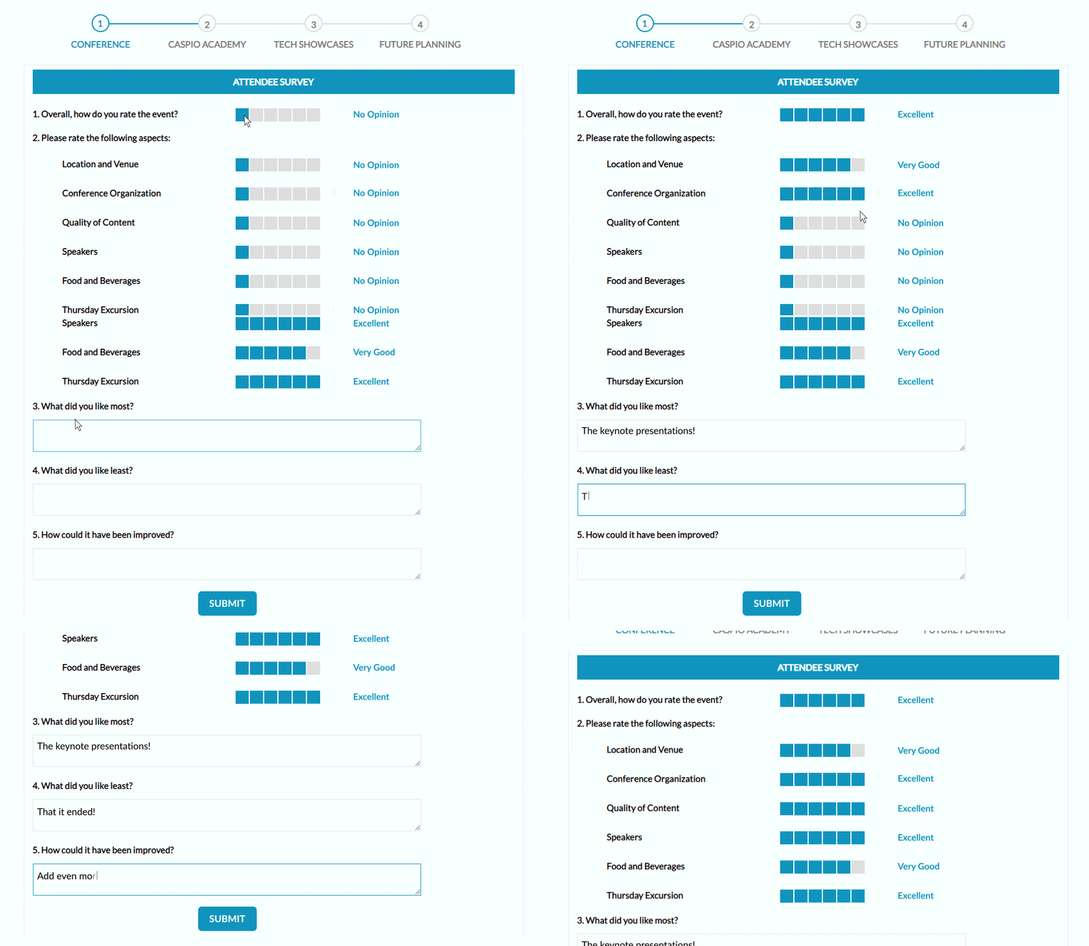
Web form conversion optimization is not just for marketers. It’s something to ponder on any time you use forms to collect orders, subscriber information, customer feedback and product inquiries. Each successful interaction grows your business, while each failed attempt is a lost opportunity.
So before you hit that publish button, spend a little extra time to incorporate these conversion best practices:
1. Define a Clear Purpose
- What is the most important information to collect? Limit to as few fields as possible or consider breaking the form into two steps.
- What data formats are required? Set up your fields to collect data in the appropriate data formats. Include a calendar to make it easier for users to enter a date. To avoid typos, use an email field for email submissions, which will display an error if users enter text that’s not in an email format. Then, set up a second email confirmation field for good measure. Don’t forget to check the required field box.
2. Design with Direction
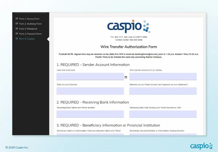
- Position form prominently at the top of the page. Include an attention-grabbing headline so the user instantly understands what you’re asking them to do.
- Stick to a clean and simple design. Choose a font and color palette that’s easy on the eyes and professionally matches your website or brand.
- Keep field labels short. If more explanation is needed, consider adding a small tip next to the field.
- Use a large button in a strong color. The button should demand attention with action-oriented text such as “Sign Up for Free” or “Subscribe Now”.
- Limit any distractions around the form. Eliminate surrounding clutter such as graphics, links or navigation that may sidetrack users from completing the form.
3. Test and Tweak
- Check your error messages. Validation and error messages should display right next to each field (usually in red) and clearly instruct users on how they can correct problems.
- Test all the fields and steps. Your form isn’t complete unless it works properly with the least amount of “do-overs”.
Remember, users are impatient. Make it easy for them to fill out your form or they can get frustrated and exit your page or app. When asking people to fill out a web form, time is truly gold.
From Web Forms Conversion to Digital Transformation
With Caspio, you have the power to create optimized web forms that make your prospects want to give you all the information you need. By implementing the simple best practices mentioned above, you improve the overall user experience (UX) of your forms and increase their conversion rates.
However, optimizing forms not only raises conversions, it also leads to digital transformation.
Nightingale Home Healthcare, which provides in-home care to senior citizens across 11 states, constantly dealt with a flood of admin requests from multiple locations. With minimal coding experience, web and art director Rajesh Relan solved the challenge by building custom web forms in Caspio.
He then developed an application for patients to submit testimonials from any location. “In this industry, sharing customer testimonials effectively is important and mission-critical,” he said.
I would 100% recommend Caspio to other companies that need to automate their processes. It can handle many issues, no matter how simple or complicated.
Rajesh Relan
Web and Art Director
Nightingale Home Healthcare
North Texas-based Collin College, which serves 59,000 students annually, used to struggle with registrations. “Whenever somebody submits an application, that gets emailed to me. I’d have to take that email and then put it into an Excel document,” shared Steven Rogers, assistant director of student engagement.
Using Caspio, Rogers and his colleagues built an online registration tool that eliminated paper-based processes and accelerated the collection of student information.
“My favorite things about Caspio are that it saves me a lot of time, saves me a lot of stress, and it helps me get the information that I need very quickly,” he said.
Convert Your Business With Low-Code Web Forms
With Caspio, you too can create web forms that not just convert users but also help your business digitally transform, especially in these unprecedented times.
Caspio’s low-code platform provides you with all the tools you need to create, customize and deploy powerful web forms, all without having to hand code.
By using Caspio’s intuitive point-and-click tools instead of painstakingly writing down line after line of code, you gain the agility to build and deploy cloud apps and forms 10-20x faster. The sooner you build the forms, the sooner you get the leads, subscriptions and sales.
Want to learn more?
Check out our Ultimate Video Guide: How to Build Web Forms Without Coding. This comprehensive, step-by-step video series shows you how to easily build web forms, using online surveys as a sample use case. Get tips on building multi-step and relational forms that “talk” to each other.
Alternatively, schedule a free consultation with one of our specialists today to see how Caspio can help you create optimized web forms that bring in leads, subscriptions and sales for your business.
